How to Use IBM's Carbon Design System (React) to Create a Quick UI
Using a design system to speed up your UI development process.
When you get to building your web application’s UI, it can be handy to work with a design system. This allows you to rather effortlessly create quick and responsive interfaces, that generally have properties (props) defined in them that allow you to also generate your UX. An extremely popular design framework is Google’s Material UI. However, another not as well known, but nonetheless full fledged design system is IBM’s design system, Carbon.
What is the Carbon Design System?
From the Carbon homepage,
Carbon is IBM’s open source design system for products and digital experiences. With the IBM Design Language as its foundation, the system consists of working code, design tools and resources, human interface guidelines, and a vibrant community of contributors.
The system is built for developers to use either React, Angular, or Vue. The site carbondesignsystem.com has all their components completely open source, design guidelines, color palette examples, and tutorials. The IBM color theme which primarily incorporates offset whites, multiple shades of blue, and of course carbon black, was the inspiration for SocioProphet’s design theme.
While SocioProphet no longer uses any Carbon components, or any part of the Carbon Design System, it was an extremely useful starting point. So, I’ll explain how to get started using Carbon in you React project, and give an example of the simple interface we created to begin with!
Installing Carbon
I use yarn as my package manager, however, the following works with npm.
There are three things that need to be installed to get started, those are;
Component styles — ‘carbon-components’
React components — ‘carbon-components-react’
React icons (for the components) — ‘@carbon/icons-react;
So, in your project (or globally if you prefer),
yarn add carbon-components carbon-components-react @carbon/icons-react carbon-iconsCarbon styles uses Sass, which is a CSS preprocessor that gives you the ability to ‘program’ CSS. This includes things like variables, inheritance, etc. Essentially Sass is a CSS superset. Anyway, we need to install that as well.
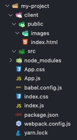
yarn add sassIn you React project, you will typically have the following structure;
After installing Sass and the three Carbon packages, your package.json should look similar to this,
| { | |
| "name": "my-project", | |
| "version": "1.0.0", | |
| "description": "", | |
| "main": "index.js", | |
| "scripts": { | |
| "test": "echo \"Error: no test specified\" && exit 1" | |
| }, | |
| "keywords": [], | |
| "author": "", | |
| "license": "ISC", | |
| "dependencies": { | |
| "@carbon/icons-react": "^10.33.0", | |
| "carbon-components": "^10.36.0", | |
| "carbon-components-react": "^7.36.0", | |
| "carbon-icons": "^7.0.7", | |
| "sass": "^1.34.1" | |
| } | |
| } |
You will also need to change App.css extension to App.scss and make sure you change the import in App.js to include App.scss.
If you used ‘npx create-react-app’ to begin your application, you won’t need to worry about the following additions. However, if you are configuring Webpack from scratch, you’ll need to add a few lines and another package.
yarn add sass-loadersass-loader allows Webpack to load and compile Sass (.scss) files.
For your Webpack configuration, add the sass-loader to the module rules,
module: {
    rules: [
        ...
        {
            test: /\.(s*)css$/,
            use: ['style-loader, 'css-loader', 'sass-loader']
        },
     ...
    ],
},
Now that everything is set up and installed, let’s move on to using Carbon!
Importing Components and Styles
Styles
First of all, in your index.scss add the following import,
@import 'carbon-components/scss/globals/scss/styles.scss';This import alone will apply the Carbon font family ‘IBM Plex Sans’, font sizes, weight, colors, margins and padding (along with a few other CSS values).
The import goes in the index.scss file in order to reduce the amount of re-compiling Sass will do. We want to modify our app level styles, such as App.scss as this will lead to quicker compile times.
Components
A common component you might use is a button, and of course, there is a Carbon button.
At the top of your App.js file (or whatever component will need a button), add
import { Button } from 'carbon-components-react';Then, inside the App component add,
<Button>This is a Carbon Button!</Button>So far, App.js looks like,
import React from 'react';
import { Button } from 'carbon-components-react';
import './App.scss'

const App = () => {

    return (
        <React.Fragment>
            <Button>This is a Carbon Button!</Button>
        </React.Fragment>
    );
};
export default App;
That’s it! That’s the basically all the important stuff.
It is good practice to only import what we need. To get a full understanding of how all the Carbon components are organised, you can visit the GitHub for Carbon Design System.
For example, the ‘Header’ component is under ‘carbon-components-react/lib/components/UIShell’.
So the import would be,
import { Header } from 'carbon-components-react/lib/components/UIShell'.Building a UI From the Carbon Design System
I’ll give an example of how we (SocioProphet) used Carbon to build a quick UI as a solid starting point.
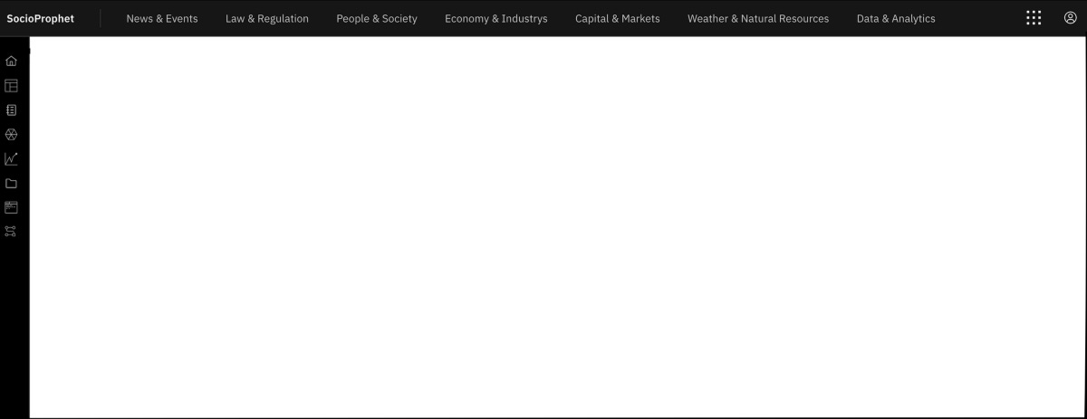
As you can see from this dashboard, we wanted a simple header that contained the site name ‘SocioProphet’, some navigation links, such as ‘News & Events’, an app switcher icon, avatar icon, and a left side panel (which expands on mouseover).
The import for this was all from ‘carbon-components-react/lib/components/UIShell’.
import {
  HeaderContainer,
  Header,
  SkipToContent,
  HeaderName,
  HeaderNavigation,
  HeaderMenuItem,
  HeaderGlobalBar,
  HeaderGlobalAction,
  SideNav,
  SideNavItems,
  SideNavLink,
  SideNavMenu,
  SideNavMenuItem,
} from "carbon-components-react/lib/components/UIShell";
The full dashboard, including link components that can’t be seen in the image above is shown below in the gist.
| import React from "react"; | |
| // Carbon Imports | |
| import { | |
| HeaderContainer, | |
| Header, | |
| SkipToContent, | |
| HeaderName, | |
| HeaderNavigation, | |
| HeaderMenuItem, | |
| HeaderGlobalBar, | |
| HeaderGlobalAction, | |
| SideNav, | |
| SideNavItems, | |
| SideNavLink, | |
| SideNavMenu, | |
| SideNavMenuItem, | |
| } from "carbon-components-react/lib/components/UIShell"; | |
| // Dashboard Styles | |
| import "./styles/dashboard.scss"; | |
| const Dashboard = () => { | |
| return ( | |
| <div> | |
| <HeaderContainer | |
| render={({ isSideNavExpanded, onClickSideNavExpand }) => ( | |
| <Header aria-label="SocioProphet Platform"> | |
| {/* | |
| SkipToContent is for web based screen readers | |
| */} | |
| <SkipToContent /> | |
| {/* | |
| Header site name component | |
| */} | |
| <HeaderName href="/dashboardHome" prefix=""> | |
| SocioProphet | |
| </HeaderName> | |
| {/* | |
| Header Navigation component with 'HeaderMenuItem for each navigation link | |
| */} | |
| <HeaderNavigation aria-label="SocioProphet Platform"> | |
| <HeaderMenuItem>News & Events</HeaderMenuItem> | |
| <HeaderMenuItem>Law & Regulation</HeaderMenuItem> | |
| <HeaderMenuItem>People & Society</HeaderMenuItem> | |
| <HeaderMenuItem>Economy & Industries</HeaderMenuItem> | |
| <HeaderMenuItem>Capital & Markets</HeaderMenuItem> | |
| <HeaderMenuItem>Weather & Natural Resources</HeaderMenuItem> | |
| <HeaderMenuItem>Data & Analytics</HeaderMenuItem> | |
| </HeaderNavigation> | |
| {/* | |
| Right-hand action section of navigation including app switcher icon and avatar icon | |
| */} | |
| <HeaderGlobalBar> | |
| {/* App switcher in right top nav */} | |
| <HeaderGlobalAction aria-label="App Switcher"> | |
| <svg | |
| focusable="false" | |
| preserveAspectRatio="xMidYMid meet" | |
| xmlns="http://www.w3.org/2000/svg" | |
| width="24" | |
| height="24" | |
| viewBox="0 0 24 24" | |
| aria-hidden="true" | |
| > | |
| <path d="M18 18h3v3h-3zm-7.5 0h3v3h-3zM3 18h3v3H3zm15-7.5h3v3h-3zm-7.5 0h3v3h-3zm-7.5 0h3v3H3zM18 3h3v3h-3zm-7.5 0h3v3h-3zM3 3h3v3H3z"></path> | |
| </svg> | |
| </HeaderGlobalAction> | |
| {/* Avatar icon in right top nav */} | |
| <HeaderGlobalAction | |
| aria-label="Avatar" | |
| onClick={onClickSideNavExpand} | |
| isActive={isSideNavExpanded} | |
| > | |
| <svg width="20" height="20"> | |
| <title>user</title> | |
| <path d="M6 15.745A6.968 6.968 0 0 0 10 17a6.968 6.968 0 0 0 4-1.255V15.5a2.5 2.5 0 0 0-2.5-2.5h-3A2.5 2.5 0 0 0 6 15.5v.245zm-.956-.802A3.5 3.5 0 0 1 8.5 12h3a3.5 3.5 0 0 1 3.456 2.943 7 7 0 1 0-9.912 0zM10 18a8 8 0 1 1 0-16 8 8 0 0 1 0 16z"></path> | |
| <path d="M10 9.841a2 2 0 1 0 0-4 2 2 0 0 0 0 4zm0 1a3 3 0 1 1 0-6 3 3 0 0 1 0 6z"></path> | |
| </svg> | |
| </HeaderGlobalAction> | |
| </HeaderGlobalBar> | |
| {/* | |
| Left Side Navigation component which is actually tied in with the overall Header component | |
| */} | |
| <SideNav aria-label="Side navigation" isRail> | |
| <SideNavItems className="black"> | |
| <SideNavLink>Home</SideNavLink> | |
| <SideNavLink>User Dashboard</SideNavLink> | |
| <SideNavMenu> | |
| <SideNavMenuItem href="#">Item</SideNavMenuItem> | |
| </SideNavMenu> | |
| <SideNavMenu> | |
| <SideNavMenuItem href="#">Item</SideNavMenuItem> | |
| </SideNavMenu> | |
| <SideNavMenu> | |
| <SideNavMenuItem href="#">Item</SideNavMenuItem> | |
| <SideNavMenuItem href="#">Item</SideNavMenuItem> | |
| </SideNavMenu> | |
| </SideNavItems> | |
| </SideNav> | |
| </Header> | |
| )} | |
| /> | |
| </div> | |
| ); | |
| }; | |
| export default Dashboard; |
This is about as simple as it gets, since all these components have many props that can be used to give your site functionality. The above file shows a quick mock-up UI that met our initial requirements.
Carbon Resources
Carbon Design System has three primary themes (all open source) that I am aware of, I’ll share the React Storybooks for those here.
Open Source Storybooks
№2 and №3 provide extensions of the classic Carbon components, and №3 is used in Watson IoT components.
For SocioProphet’s UI (a few iterations in) we were using a combination of components from all three Storybooks.
Further Note
The Carbon Homepage provides lots of great learning resources to get started. This article touches briefly on a couple of ‘getting started’ ideas but if you’re eager to learn more, be sure to check out the free tutorial and earn one of those IBM badges! 😃
Click Here for the Carbon React Tutorial
I hope this article was potentially helpful to one of your future projects! Check out my previous post on how to use a Makefile and Bash scripts to automate terminal commands when running a React application…


